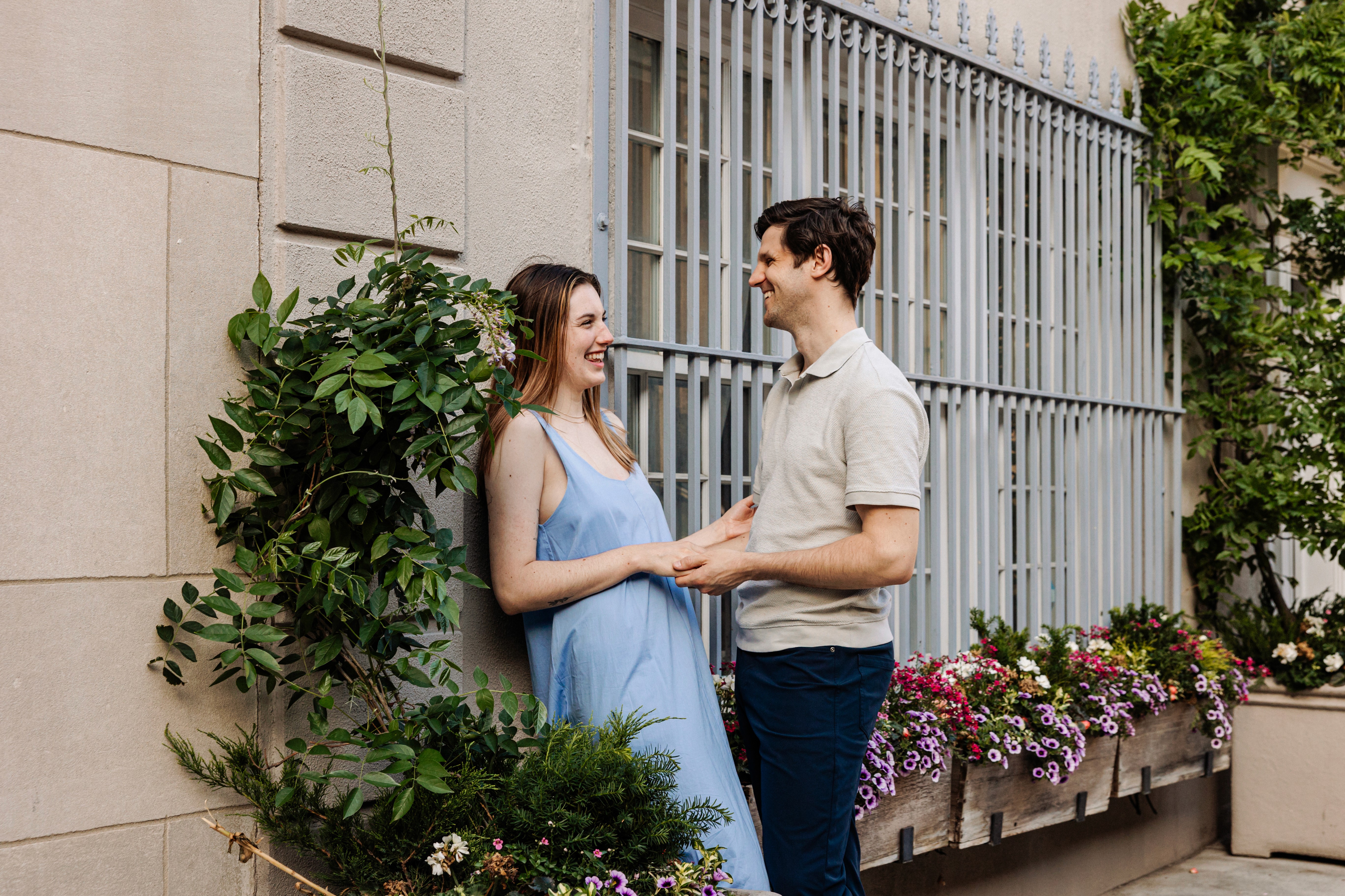
"What do we wear?" is the question I get more than any other before a session — and it totally makes sense. Clothing is one of the few things you can fully control before the shoot, and it has such an impact on how your photos turn out. The good news: there's no perfect answer, and you can't really get this wrong if you follow a few simple principles.
So without further ado, here's my honest, practical guide — built on years of photographing couples, families, and individuals in New York City and Saratoga Springs.
The One Rule That Matters Most
Wear what makes you feel like yourself.
This sounds obvious but it gets ignored constantly. People show up in outfits they bought for the session, have never worn before, and that don't feel like them — and it tracks in the photos. Comfort reads on camera. Confidence reads on camera. If it doesn't feel like you, neither will your photos.
If you live in jeans and a great blazer, wear that. If you're a sundress person, wear a sundress. The goal is photos that look like you — not a stock photo version of you.
For Couples Sessions
Coordinate, don't match.
Identical outfits look forced. The goal is visual harmony — colors and tones that work together without being identical. A few approaches that always work:
Neutral + one color: One person in white, cream, or beige; the other in a soft color that complements them. Earthy tones (sage, rust, dusty blue, warm tan) photograph beautifully.
Tonal dressing: Both wear shades within the same color family — both in blues, or both in earth tones, at different depths.
Classic and editorial: For NYC sessions especially, sharp and styled works great. A well-cut suit and a great dress. Clean and intentional.
What to avoid:
Busy patterns and logos — they compete with your faces and date the photos quickly
Colors that clash with your setting (neon in a park, all-black in direct sun)
For Family Sessions
Pick a palette, not a uniform.
Choose 3–4 colors that work together and let each person dress within that color family. This gives the photos cohesion without the rigidity of matching outfits — and it means everyone can wear something they actually like.
A palette I love for fall Saratoga sessions: warm cream, rust, forest green, and denim. A palette that works year-round in NYC: navy, white, and a soft neutral like taupe or blush.
For kids specifically:
Dress them first, then build the adults' outfits around them — kids' options are more limited
Layers are great for kids because they give you variety within a single session
Avoid stiff or uncomfortable clothes they'll spend the session more concerned with than my camera!
For Maternity Sessions
Show the bump. Don't hide it.
That's what we're here for! It's beautiful — and fitted or draped clothing that acknowledges it will photograph far better than anything boxy or oversized.
What works well:
Fitted wrap dresses in solid, rich colors
Flowy maxi dresses with movement (great for outdoor sessions in Saratoga)
A great pair of maternity jeans and a beautiful top or jacket for something more casual and editorial
Avoid maternity-specific "photo session" dresses if you can — they often look generic. A well-fitted regular dress in a size that works for your bump almost always looks more authentic.
For Vacation and Lifestyle Sessions
Bring options.
If you're visiting New York City or Saratoga Springs and booking a vacation session, pack 2–3 outfits and we can decide on the day based on location and light. Layers are always smart — a great jacket or overshirt can transform an outfit and give you variety without a full wardrobe change.
For NYC sessions, I lean toward outfits with some intention behind them — the city is a backdrop that's larger than life, and your look should hold its own against it. For Saratoga, you can be slightly more relaxed: linen, sundresses, and casual-chic work sensationally with the parks and architecture.
Colors That Always Work in Photos
These colors photograph well across skin tones and most locations:
Cream and warm white — clean, timeless, flattering
Sage and dusty green — earthy and current without being trendy
Rust and burnt orange — especially strong in fall and golden hour light
Navy and deep blue — classic, works everywhere
Soft blush and dusty rose — especially beautiful in natural light
Camel and tan — sophisticated, pairs well with everything
Colors to Approach Carefully
Neon and bold brights — can cast color onto your skin in natural light
Pure white in harsh sun — can blow out; opt for cream or off-white
Very dark colors in low light — can lose detail in shadows
Head-to-toe black for groups — tends to flatten and merge; at least one person should break it up
The Practical Stuff
Bring backup options. Throw an extra top in your bag. Outfit changes mid-session can refresh the energy and give you more variety in your gallery.
Fit matters more than label. A $40 dress that fits perfectly photographs better than a $400 one that doesn't. If something has been sitting in your closet unworn, there's a reason. Don't force it into your session.
Do your hair and makeup how you normally would. If you never wear heavy makeup, a little mascara and lip gloss goes a long way. If you normally wear a full face, go glam! The goal is you, elevated — not transformed.
Bring anything that's meaningful. A scarf you love. Jewelry with history. Your pup. These details make the session yours.
What I Send You After Booking
Every LSP client receives a full pre-session style guide after booking — customized for the season, location, and session. You'll feel completely prepared before we even meet.
Ready to Book?
I'd love to work with you.
NOW BOOKING